Project Summary
Unitywater has embarked on the digital strategy for making data driven decisions as a key enabler for holistic asset management. Under this strategy, Unitywater has developed interactive Asset Management Plans incorporating live dashboards for continuous reporting on the performance of 13 Sewerage Treatment Plants and 798 Sewerage Pumping Stations. These dashboards provide a single point of truth and have functionality that allows users to drill down into the fine details of a fault or concerning trend. The dashboards provide live updates on the Key Performance Indicators to the executives for these asset portfolios. The easy accessibility and reliability of the information have led to a significant improvement in the condition and criticality assessments, increased renewal spending and improved preventative maintenance program.
Project Description
Unitywater provides high-quality, safe and reliable water supply and sewerage services to Moreton Bay, Sunshine Coast and Noosa communities. Unitywater aims to be a sustainable, industry-leading, community and customer-orientated water and allied services business and operates and manages assets worth $3.5B value. The written value of the Sewerage Treatment Plants (STPs) and Sewerage Pumping Stations (SPSs) assets is estimated close to half of the total written down value of the whole asset base.
The paper-based Asset Management Plans (AMPs) for these asset portfolios are static in nature and generally considered as strategic documents for reference only. The key information provided in the paper-based AMPs related to asset portfolio, asset performance, risk management and financial performance becomes outdated as soon as the document revision is complete. In accordance with the International Standard for Asset Management ISO 55000, Unitywater has developed data driven interactive AMPs for improving procedures on how the information related to assets is analysed, reported, valued and acted upon as a single source of truth across all business functions. Figure 1, shows how the information for the various components of an AMP is presented in the live dashboards that are published within the corporate BI workspace and open to anyone within the organisation. The key advantages for the interactive AMPs are:
- They provide a single point of truth with embedded governance
- Give users access to extensive analytics capabilities
- Provide different ‘views’ of the underlying data model
- Can easily be modified to extend capabilities
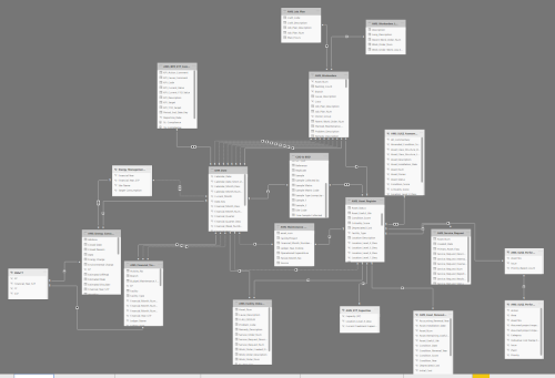
Program and Project Management:
The building of dashboards was started in the year 2018-19 and has gone through various upgrades since then based on the stakeholder feedback. These dashboards are built in-house and are still work in progress. The dashboards are linked to the live information from the corporate financial register, asset master data, work and service order history, inspection records, capital/renewal plan register, energy and customer databases and population forecast models (refer Figure 9). The Data Model built with linking all this information to an asset level is the core of its functionality. The Data Model collects, organizes and compiles all the data and carries out the calculations required in the dashboards. Definitions for the calculations of various KPIs presented on the dashboards were agreed upon among various stakeholders, which helped in removing any confusion and thus improving the cross-functional collaboration.
Establishing an appropriate Data Model requires relatively advanced IT capabilities and skillsets. The corporate Business Intelligence Unit and IT Section were thoroughly consulted for the development of the Data Model and for access to the data warehouses. Various SQL, DAX and Python scripting was used to build the “smartness” in the dashboards.
Benefits to the Organisation:
Some of the critical Asset Portfolio Objective performance for Unitywater’s STP fleet are provided in Figure 2 to 5. The information provided on these figures is as of 01/03/22 (at the time of writing this submission). As shown in these Figures, the users can drill into individual STP for investigating data on the location hierarchy of various process trains and then assets within them and can further drill down to the work order level if relevant.
The development of these dashboards has resulted in various benefits to Unitywater. The delivery of planned maintenance is measured using ‘Preventative Maintenance Adherence’ (Figure 2) and ‘Planned Maintenance Backlog’ (Figure 3) service level measures. Both these measures saw major performance deterioration in 2017-18 and 2018-19. The reporting and visibility of this data through the dashboard has led to the performance trend improvement since 2019-20 due to a major Preventative Maintenance Program re-alignment driven by the executive team.
There are also improvements in the scheduling of planned work such as bundling of work per STP to improve maintainer productivity. Reduction in backlog and improved scheduling resulted in improvement in STP ‘Preventative Maintenance Adherence’ from 33% in 2018-19 to 86% in 2019-20 FYTD. The availability of this information on the dashboard drives the behaviours to keep pushing for meeting the 80% target for ‘Preventative Maintenance Adherence’ and bring focus on the resource issues.
Operational risk arising from critical asset failures is measured using the ‘Mean Days to Critical Repair’ service level measure. This measure illustrates (Figure 4) a steady increase in means day to critical asset fail time from 2018-19. The visibility of this information on the dashboard helped in minimising the impact of critical failures due to long delays in repairs and loss of redundancy due to out of service equipment (Figures 6 and 7 show further drill down on the hierarchy level for Means Day to Critical Fault). This also helped in developing business cases for the renewal projects and thus a 10% increase in the STP renewal budget.
A downward trend in the % of reactive maintenance cost has been observed since the development of the dashboard in 2018-19 (Figure 5). The reactive maintenance cost % is the reactive maintenance share of the total maintenance spending. Reduced reactive maintenance through planned maintenance reduces the risk of failing compliance, cost or customer service requirements. The dashboards provided the feedback loop on the status as insufficient preventative and corrective maintenance completion causes more reactive maintenance which consumes resources that have been allocated to planned work. In the absence of the dashboard, it may be left unchecked and then the reactive feedback loop makes it increasingly harder to meet compliance, cost and customer expectations into the future.
The development of dashboards has also helped in the development of an improvement plan to address assets above the risk threshold. The improvement plan is designed to align the STP fleet with all service level requirements. Figure 8, shows that dashboard has highlighted the presence of high and extreme risk assets in the process train. The identification of high-risk mechanical assets in the Biological Treatment Process train led to further root cause analysis and understanding that the risk is largely due to foreign debris and grit in the influent not being sufficiently removed at the inlet works. Similar root cause analyses identified that the concentration of risk in civil assets in Biological Treatment is caused by aging valving at South Caboolture and Bribie Island STP and concentration of risk in electrical assets is caused by Variable Speed Drives in the fleet which were identified as an obsolescence performance issue.
Opinion as to specific contribution
These dashboards were developed in house by Unitywater’s Senior Asset Analytical Engineer (Gagneet Serai). His engineering background and a degree in Data Science provided him with a solid platform in designing and delivering this project. The support from the Business Intelligence Team and IT team was crucial for the project to develop Data Model and make dashboards available online for view. Maintenance planners and schedulers, treatment plant operators, accountants, customer services also played a key role in the development of the measurable KPI.
The Head of Asset Management provided this vision for making data driven decisions for holistic asset management in Unitywater.
In short, I would say, it was a coordinated activity within Unitywater to realise the values of the STP and SPS assets.
General Comments
The submission is mainly focused on the STPs interactive AMP and associated dashboards. Similar dashboards for SPS exit and used by the business specifically for root cause analyses for the worst performing pump stations. A documented AMP for the STPs is provided as an attachment for providing further insight into the submission.
This project was selected as a leading practice by the Water Services Association of Australia (WSAA) in the Asset Management Customer Value (AMCV) benchmarking exercise in 2020. About 50 major water industries across Australia participated in this benchmarking exercise (A presentation made to the leading practice conference is attached to provide further insight to the submission – please view it as a slide show).
The developer of the dashboard has been awarded the Young Digital Leader of the Year Award for the utility sector in 2020-21 for this outstanding work.
The summation has been approved by the Head of Asset Management Unitywater.
Figure 1 – Relationship between AMP Report Structure and Dashboards
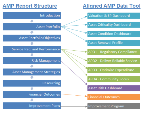
Figure 2 – Screenshot of the dashboard on adherence on Preventative Maintenance Program (The maintenance planner can drill down to individual STP and assess where and which resource has issue with the adherence with maintenance program – thus act on it)

Figure 3 – Screenshot of the dashboard on Planned Maintenance Backlog (The maintenance planner can drill down to individual STP and assess where and which resource has issue with the backlog – thus act on it)

Figure 4 – Screenshot of the dashboard on Mean Day to Critical Fault (Figure 6 and 7 show the same dashboard with further drill down to Coolum STP and then to the process train level)
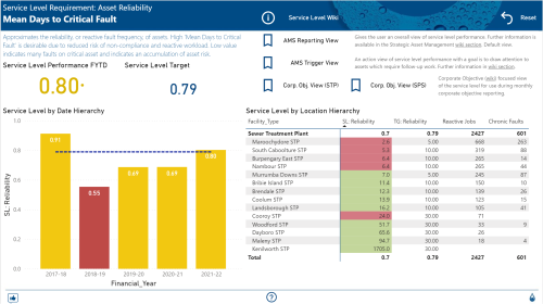
Figure 5 – Screenshot of the dashboard on % Reactive Maintenance cost of the total maintenance cost (the dashboard shows, which STPs are not meeting the target)

Figure 6 – Screenshot of the dashboard on Mean Day to Critical Fault (drilled down to Coolum STP level)

Figure 7 – Screenshot of the dashboard on Mean Day to Critical Fault (drilled down to Coolum STP/Treatment Process Train level – this shows 7 Choric Faults at the Stage 1 Bioreactor Location – this has instigated a Root Cause Analysis to rectify the problem)

Figure 8 – Screenshot of the dashboard on the risk associated with assets in the STP portfolio (The matrix shows the process train type of assets, where the maximum high and extreme risk lies)

Figure 9 – Complexity of the Data Model used for displaying information in the various dashboards